Although many people still use desktop computers to search and view online content (in the case of our site even a large majority), the mobile first evolution keeps progressing.
And while there are tablets and we’ll see new devices with different form factors popping up, mobile first today mainly is about smartphones. Website owners, publishers, user experience experts and search engine marketing/optimization practitioners are forced to follow that evolution and why wouldn’t they; after all, it is about choice, context and convenience, isn’t it?
The end of the mobile-friendly label
As we don’t need to explain, you can show more on a larger screen than on the small screen of smartphones and for publishers and bloggers, for example, that has proven to be a challenge.

Adblockers are just one of them (and Google doesn’t like those either as you know but that has less to do with user experience). Another challenge was the decision by Google, which for many sites still is the major traffic source and for many users still key in various stages of their online journeys, to add a mobile-friendly label two years ago. You know: either your site is mobile-friendly, either it isn’t and if it isn’t that comes with consequences.
End of August Google announced that it was about to drop that mobile-friendly label. By now it is already gone. The official rationale: 85 percent of pages in mobile search by now meet Google’s criteria. However, the dissapearance of the label, Google warns, doesn’t mean that mobile-friendliness stops being a so-called ranking signal.
The start of a new mobile-friendly ranking signal
Moreover, Google takes its focus on relevance, context and user experience a step further. The search giant is about to punish mobile pages that show intrusive interstitials.
As Google says the number of such pages has grown. Publishers, bloggers and website owners can be persistent to protect their conversions and revenues.
“Frustrating for the user” Google judges and you know what that means. With user and context being king, time for action. So, after January 2017, all those pages where the content is not immediately accessible because of all forms of interstitials that visually obscure it, “may” not rank as highly as others.
Interstitials on mobile: the bad, the good and the in-between
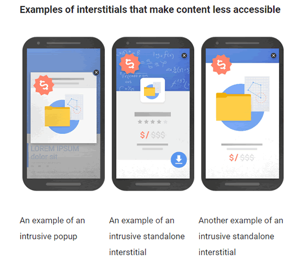
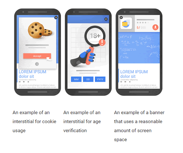
The rules don’t apply to all interstitials that make content less accessible right away. Intrusive popups and standalone interstitials, for instance, will be or “may” be “pusnished”. Examples below.

Interstitials which, for instance, regard cookie consent, age verification, logins and the likes are safe. The same goes for banners which use a “reasonable amount of screen space”. How much is reasonable? Well, Google gives a few examples on its blog via images as you can see above and below and gives the example of app install banners provided by Safari and Chrome as being good ones.

Should you be scared if your site is using large interstitials on mobile pages? Obviously not. Search intent is still the major ranking factor Google says and this new initiative is just one of hundreds.
On the other hand, you of course want to make sure that the mobile user experience your website offers isn’t affected by those large interstitials as user is king and it does help to think a little bit like Google now and then.
As usual, debates, questions and opinions are welcomed on Google’s webmaster forums and you can keep using, among others, Google’s mobile-friendly test to see if your site’s mobile user experience is OK according to Google, even if that mobile-friendly label drops.
Optimizing for people means optimizing for context and experiences and that includes the devices and media too.
Top image: Shutterstock – Copyright: CHAIWATPHOTOS


