 Unless you’ve been off the planet for a while, you’ve probably heard a lot of talk about how important landing page optimization is to increasing conversions on your website. With the power of email marketing, search and, yes, even social, in driving so much traffic, having landing pages which are relevant and effective is critical for success.
However you want to imagine it, the landing page is what catches the eye of a web visitor, introduces the offering and makes the call-to-action to convert a visitor into a buyer, lead, etc. So, you want to make sure your landing pages are optimized and effective in driving conversions.
Testing is a critical element here. No matter how good your pages are performing, you should be testing them and optimizing them. Look, if they’re spinning gold then leave them alone, but honestly, are all your landing pages doing that? Are any of them doing that? There’s always room for improvement – that’s what CRO is all about: incremental improvements on a consistent basis, looking at data but most of all at people’s needs.
Landing pages, email marketing, search marketing and most other forms of interactive marketing go hand in hand. Each product and or service can have its own landing page and that page should be keyword rich and valuable for your business and thus, by definition, your visitors.
Remove the bells and whistles
Your landing pages are not your website. Websites have to cater to a whole bunch of different needs, but landing pages are specific to a given product, service or action and that’s where the focus should be. Keep distractions to a minimum! Remove the bells and whistles you might have on other pages of your site – you might even want to remove or reduce navigation to a minimum.
Use images to optimize your landing pages. Get your branding in there and product shots and even a short video demo. Use images for your CTAs with short and bold calls-to-action.
If people are searching for answers then your landing page should be where they get them. Identify the issue at hand and tell your visitor why you have the solution. Keep it short and to the point. This is where bullet points come in handy. Don’t write them a novel, just give them the best damn landing page they’ve ever read.
If the person does convert (or even if they just ask for more info via a form), make sure you thank them for the business with a thank you message/page and then take the opportunity to very briefly offer them other solutions you may have.
Optimizing landing page conversion? Test, test, test!
Finally, I’m going to repeat myself just to be sure one of the most important things sinks in. Test every element of your landing pages. From colours to images to text, every single element of a landing page plays its role in getting you that conversion. Create a testing plan for your pages, decide what your test goals are and then see if you can improve results.
You can think of a landing page as you would of a really good salesperson. You come in the store and they engage you, identify your problem then offer you a relevant solution which provides good value for the cost.
They don’t waste time talking about the game on TV last night unless that talk is going to help them sell you a TV. But most of all, they offer you what you need to know and experience to buy that TV.
More landing page conversion and optimization tips
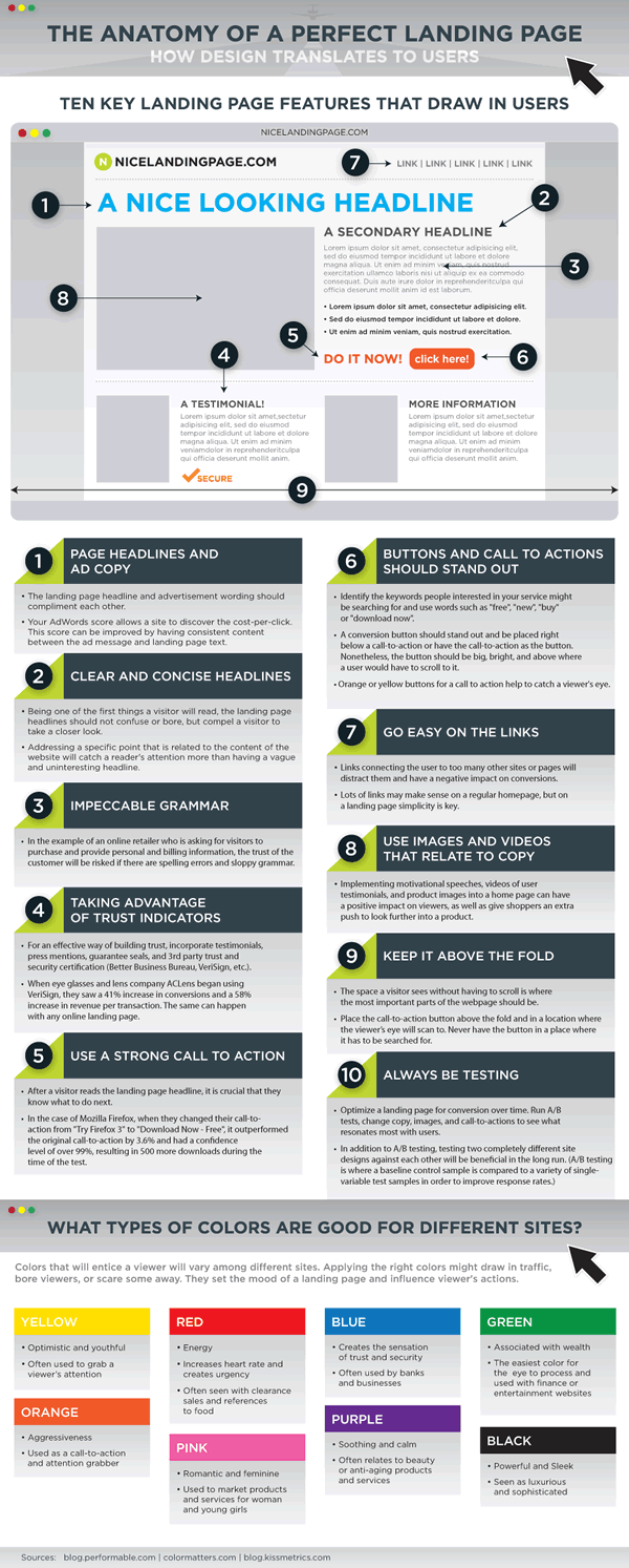
KISSmetrics made a nice infographic with plenty of landing page tips. Some areas to watch:
- Page headlines and ad copy.
- Clear and concise headlines.
- Impeccable grammar.
- Taking advantage of trust indicators.
- Use a strong call to action.
- Buttons and calls to action should stand out.
- Go easy on the links.
- Use images and videos that relate to the copy.
- Keep it above the fold.
- Always be testing.
And remember: keep it simple, efficient, frictionless, flowing and focus on the user and customer experience. Keep the customer/visitor in mind as a good sales person would do!
Below is the infographic from KISSmetrics.

Images purchased under license from Shutterstock


