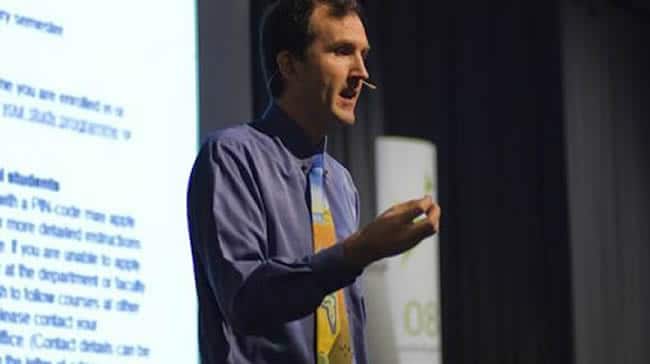
During one of two keynotes at our Fusion Marketing Experience conference, CRO, usability and digital marketing pioneer Gerry McGovern showed why and how businesses should focus on customer top tasks – the top tasks of their website visitors and customers in general.
Identify those customer top tasks, remove the distractions and clutter, make it simple, reduce the noise, and don’t fall for the cult of volume, Gerry says. In his presentation, Gerry showed the dos and don’ts, using practical examples. A summary and some key takeaways.
For Gerry McGovern the customer is the master. We are the apprentices. And the customer experience is holy. Period. Indeed, it’s not about what we, as businesses or marketers think is relevant or even functional and effective but what about website visitors, and customers decide.

Gerry illustrated this point clearly with the two screenshots below from his presentation. Which of the two SIMS3 pages worked best from a conversion perspective: the left one or the right one?

Nearly all participants voted for the right one, as they always do when Gerry asks that question. However, reality showed that the left one worked best. As marketers, we tend to fall for what we think looks more flashy, beautiful or “nice” but we forget to look at what the people that matter most, those we try to do business with, actually prefer.
Putting ourselves in the shoes of potential customers is not a good idea.
Involving the customer and actually measuring, testing and analyzing what he wants is. As Gerry says in his presentation: “Just get rid of the crappy stuff and focus on the good stuff.”
What works is what facilitates the customer top tasks
So, how do you know what is good? And where do you start? You know where to start: not in your boardroom but where the action happens: at the visitor and customer side.
That’s still not an answer to the question “what is good”? Again a simple answer: everything that helps website visitors achieve their goals or “tasks” as Gerry calls them. You find out by asking, remote testing and analyzing.

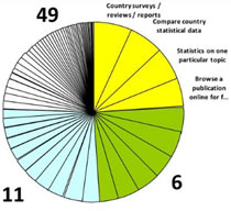
All website visitors have tasks. As Gerry shows in the first few slides of his presentation, using the website of the OECD as an example, there can be many reasons why people visit your website, or interact via other channels for that matter.
The trick is to focus on the top tasks first. As the graphic in the presentation clearly shows, there often is a very long tail of tiny tasks and a clear “long neck” of top tasks. So, start making performing the latter easier for your visitors.
How? By removing every single element that isn’t necessary and makes it actually more confusing for people to fulfill that task. Indeed, “get rid of the crappy stuff”.
Gerry McGovern uses a Telenor case as an example. The company used to have about 4,000 web pages. After analyzing, it reduced that number to 400 pages. The result: conversion rate went up by 100%, the number of emails to customer service down by 35%, and the customer satisfaction ratings went up as well.
How many web pages do you need? Relevance over quantity
Should we reduce the number of pages on our website? Fusion Marketing Experience speaker and conversion optimization guru Bryan Eisenberg seemed to say exactly the opposite, recommending to build more variations of web pages and certainly landing pages.
So, which is it? The answer again is simple: as long as the content and pages are relevant for the visitor and customer top tasks, they are good.
Furthermore, there is of course a difference between the number of web pages and the number of pages you use in testing. Finally, it’s not only about the pages as such. It’s about everything that makes it harder for people to perform their tasks: bad forms, irrelevant stock images, confusing links and so much more.
Links, the essence of the Web and of your promise need more attention, as do other elements that make your customer’s journey easier.
The time of people is precious, don’t waste it
Online marketing should get rid of the cult of volume and the focus on the wrong metrics such as the number of hits or average length per visit.
If a website is functional, it takes a visitor to his destination fast, it doesn’t keep him busy. The time of people online and in general is crucial, don’t waste it.
For many websites the top tasks, that should be emphasized are obvious. On a hotel website, you want to book a room, right? In other cases, it can be more complex. That’s where surveying, remote testing and thus involving actual users come in.
Gerry advises to use remote testing, by the way, since people who perform tasks in these tests don’t feel watched and there is no pressure and thus room for mistakes.
Measuring customer top tasks in practice: testing requires being specific
When setting up such tests and seeing where visitors fail at completing their top tasks (and thus identifying conversion bottlenecks), you must give people precise tasks to complete. Be as specific as possible and hide what you want to test in a very concrete goal.
Using the OECD example, for instance, the question that was asked to visitors was “What is the title of Box 1.2 on page 73 of OECD Employment Outlook 2009?” The real major goal was to check whether people could find the OECD country surveys and reports fast, which was the number one identified top task of visitors to the site.
Next to asking the right questions, obviously measuring is key and a comparison of the median time on a specific task (in seconds) and the pre-defined optimal time on task is an important element here. Finally, note task performance is divided into three possible outcomes: success, failure and disaster.
It’s these kinds of exercises, focusing on customer top tasks, removing the distractions and confusing elements, and testing for continuous improvement that make the difference between a website that is effective and one that isn’t.
The full downloadable presentation is only available for i-SCOOP customers and attendees of our events.

