 Attention and interest are scarce on the WWW they say. So, when you have the attention of the internet user taking the effort to visit your site, it’s important to provide them what they want fast, the safe route to conversion.
Removing hurdles to that quest is one of the goals of conversion optimization. Take away frustrations and optimize the user and customer experience (not the same).
KISSmetrics made an interesting infographic, showing eight reasons why people leave a website and adding tips to avoid it. We added a few more so you can have a better conversion rate by looking at what people want and…don’t want.
KISSmetrics’ 8 reasons why people leave your website:
- Bad navigation. Build your navigation for the visitor, not for your departments as Gerry McGovern advises in his customer top tasks approach.
- Too many ads. That’s clear.
- Bad content structure. Content marketing and conversion are also about optimizing web content and structuring the content in a visitor-friendly way.
- Obtrusive use of audio & video. How often do you watch those videos?
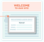
- The registration requirement. Never in the beginning or when visitors are in the middle of a task.
- Boring content and design. Put some dash in it but never put design above experiences.
- Poor legibility. Also clear.
- Lack of frequency.
10 more reasons why people leave your website:
I added 10 more reasons, feel free to add more yourself!
- No consistency between landing page and referring messages/links (‘scent’). Essential in conversion optimization.
- Lack of focus on the user journey. Conversion is all about experiences.
- Not living up to promises made in links people clicked prior to their visit, whether it’s an ad, a tweet or natural search result.
- No mobile version.
- Design and navigation reflect organization instead of customer tasks.
- Slider obsession.
- Corporate speak and focus on “us” instead of “them”.
- Missing basics inspiring trust.
- No contact possibilities.
- Lack of personality.
Check out the infographic below.


